Thurrock Contracts required a complete visual identity that reflected the professionalism, reliability and practical nature of their maintenance and contracting services. The project involved creating a full brand system, creating a consistent customer-facing experience, while still feeling approachable and local.
Services
Full Website Build
Complete Branding
Printing Assets
Share
The Logo
The primary logo combines the sprouting leaf isotype with the full Thurrock Contracts name, creating a clean, confident and instantly recognisable representation of the brand. The stem and leaves grow from the letter T, giving the symbol a clear link to landscaping and growth, while bold, uppercase lettering communicates strength, reliability and a practical approach.
Colours
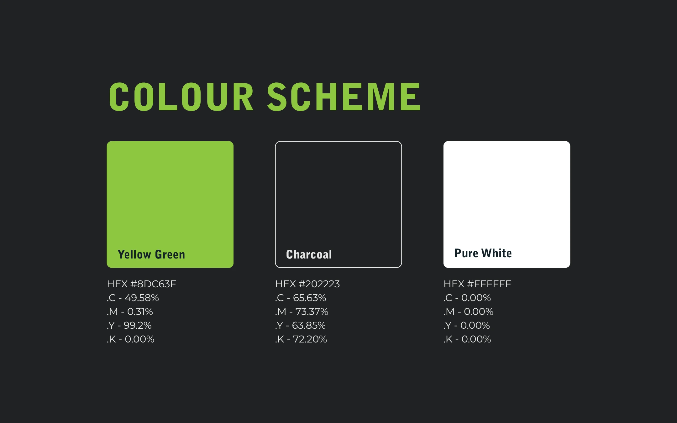
The colour scheme combines fresh yellow green, charcoal and white to create a bold, natural and highly recognisable visual identity. Together, the palette reflects a company that is trustworthy, practical and approachable, while remaining versatile across print, digital platforms, vehicles and workwear. The isotype can be used in white on green, in charcoal on white, or in green on charcoal.
Typography
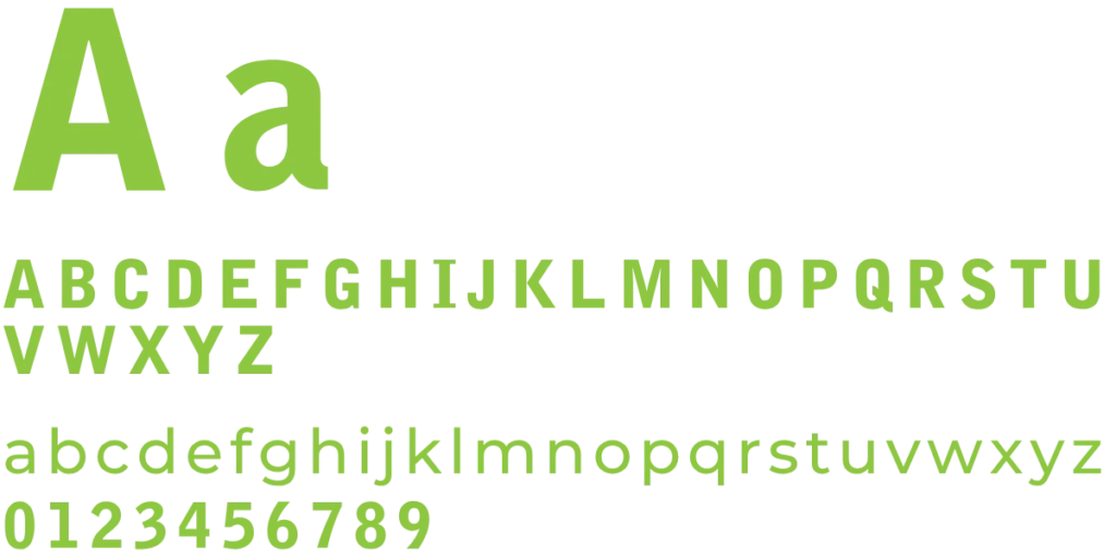
The typography pairs Bell Gothic Black for headlines with Montserrat Medium for supporting text. Bell Gothic Black’s heavy, condensed capitals give the brand a strong and dependable voice, while Montserrat Medium keeps body copy modern, clear and easy to read. Together they balance impact with clarity across print and digital applications.
Visual Identity
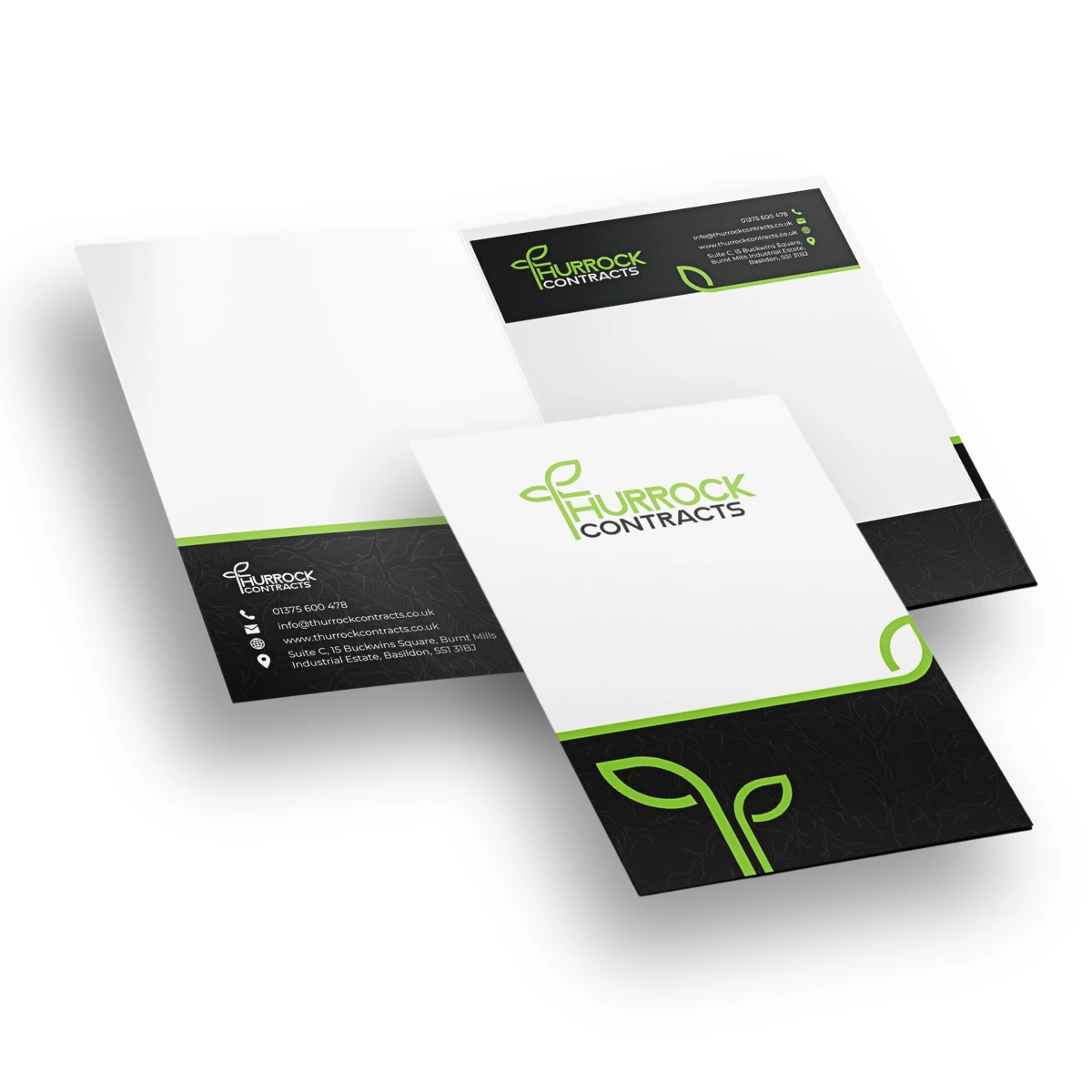
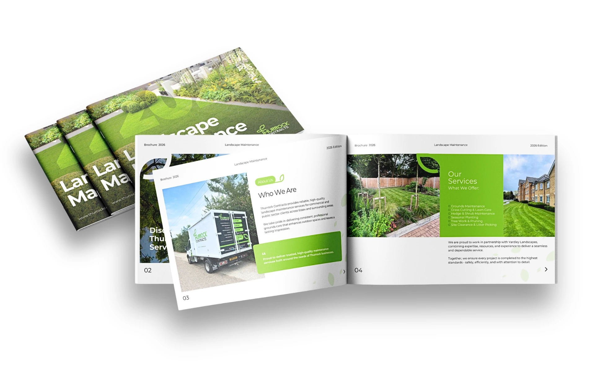
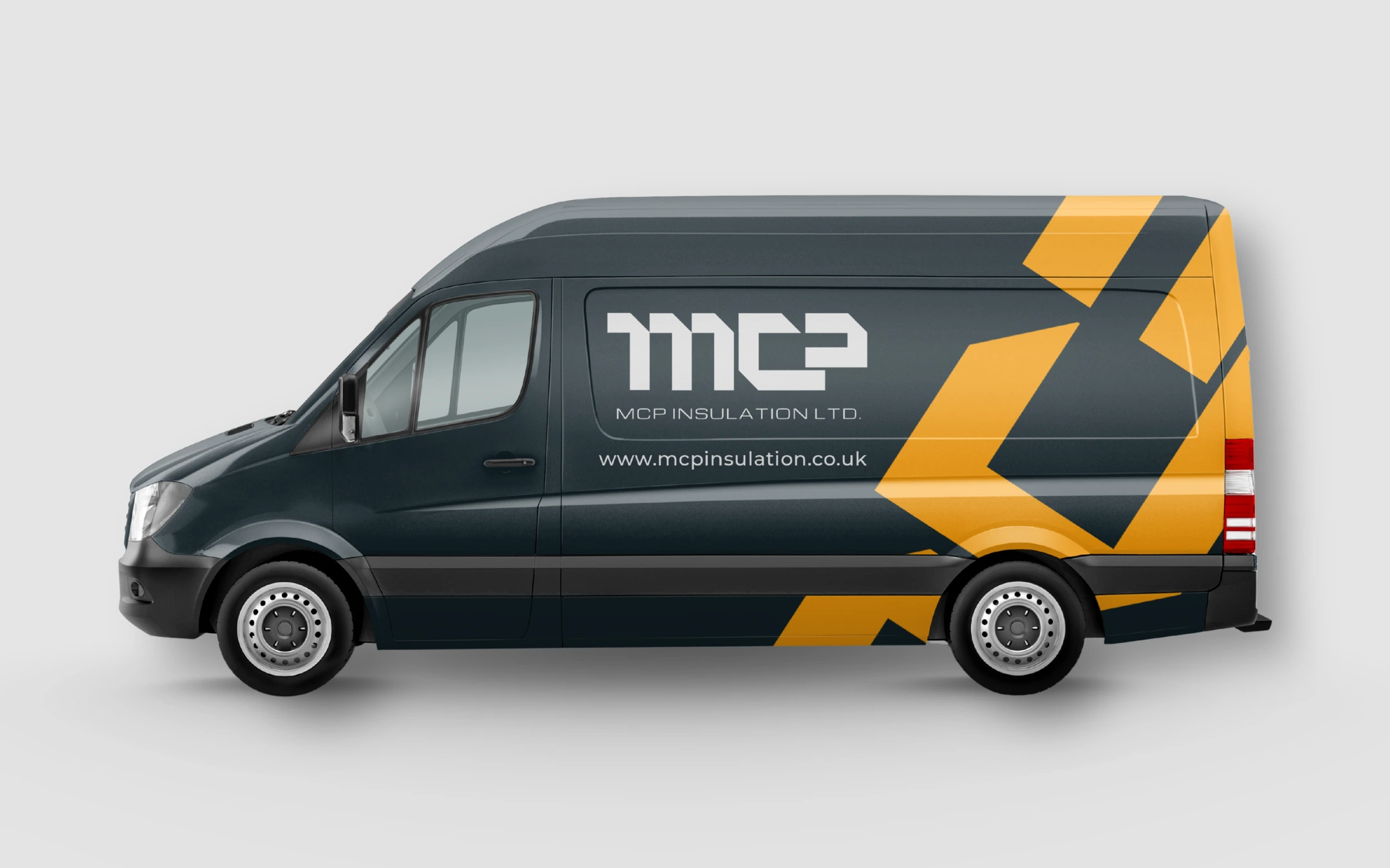
The Thurrock Contracts identity was developed to give a landscaping and contracting company a professional, reliable and approachable presence. The identity extends consistently across stationery, vehicles, workwear, brochure and website, creating a recognisable and cohesive brand across both digital and physical touchpoints
Collection
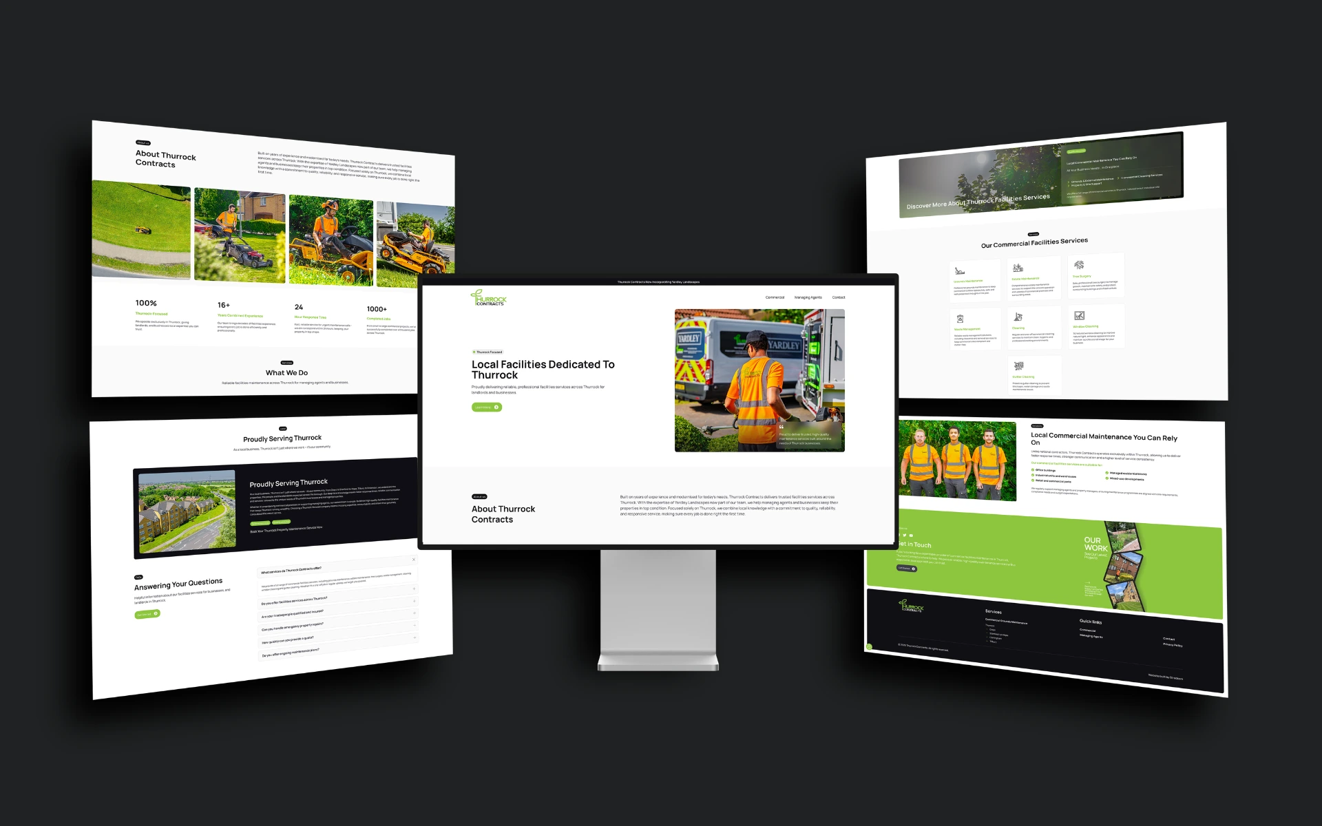
The website extends the brand into a clear, modern and easy-to-navigate digital presence. A clean layout, strong headlines and service imagery communicate what the company does at a glance, while the green call-to-action buttons and consistent typography carry the identity across every page.