This branding project was developed to give MCP Insulation Ltd a stronger,
more modern and professional presence. The process began with the creation
of a distinctive geometric logo, supported by a bold colour palette and clear
typography that reflect precision, reliability and technical expertise.
Services
Full Website Build
Complete Branding
Share
The Logo
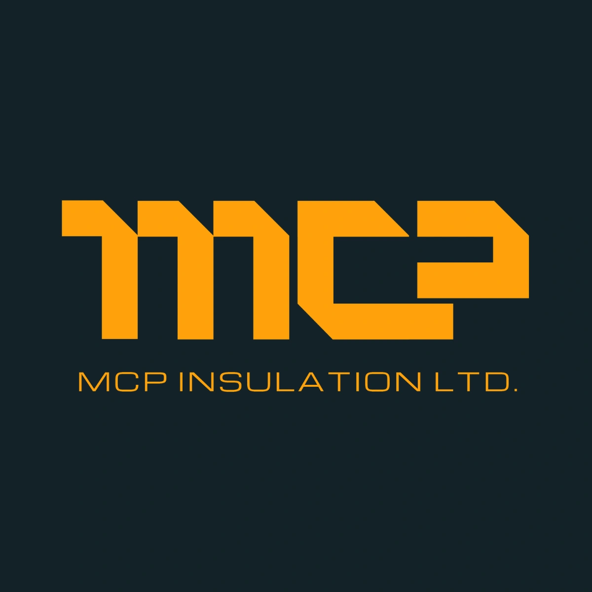
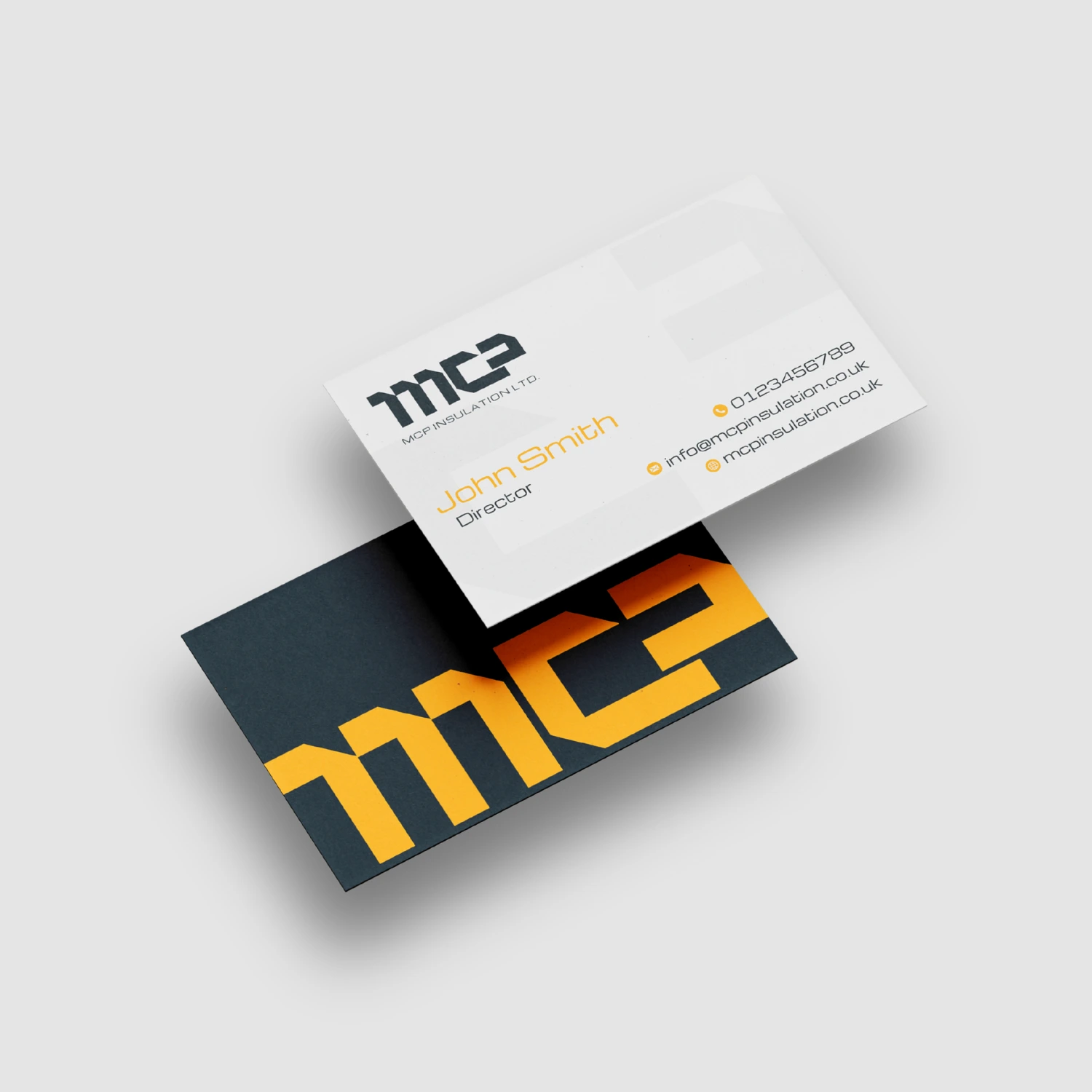
The primary logo combines the distinctive
MCP symbol with the full company name,
creating a complete and professional
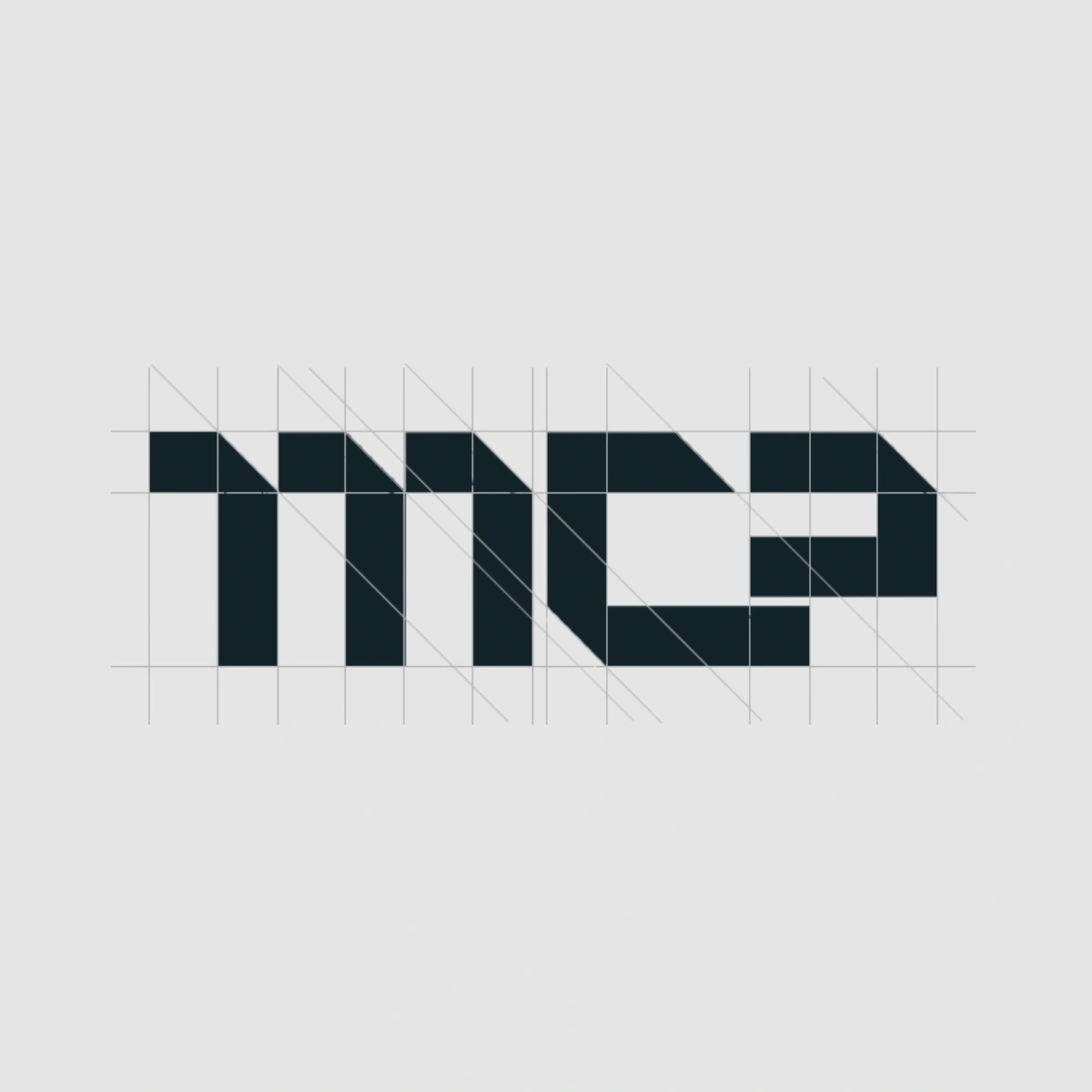
representation of the brand. Angular cuts and interconnected forms give the logo an engineered appearance, while the
bold proportions help communicate strength, capability and reliability. The company name beneath the symbol provides clarity, making this the preferred version for formal communications, website headers, signage and branded materials.
Colours
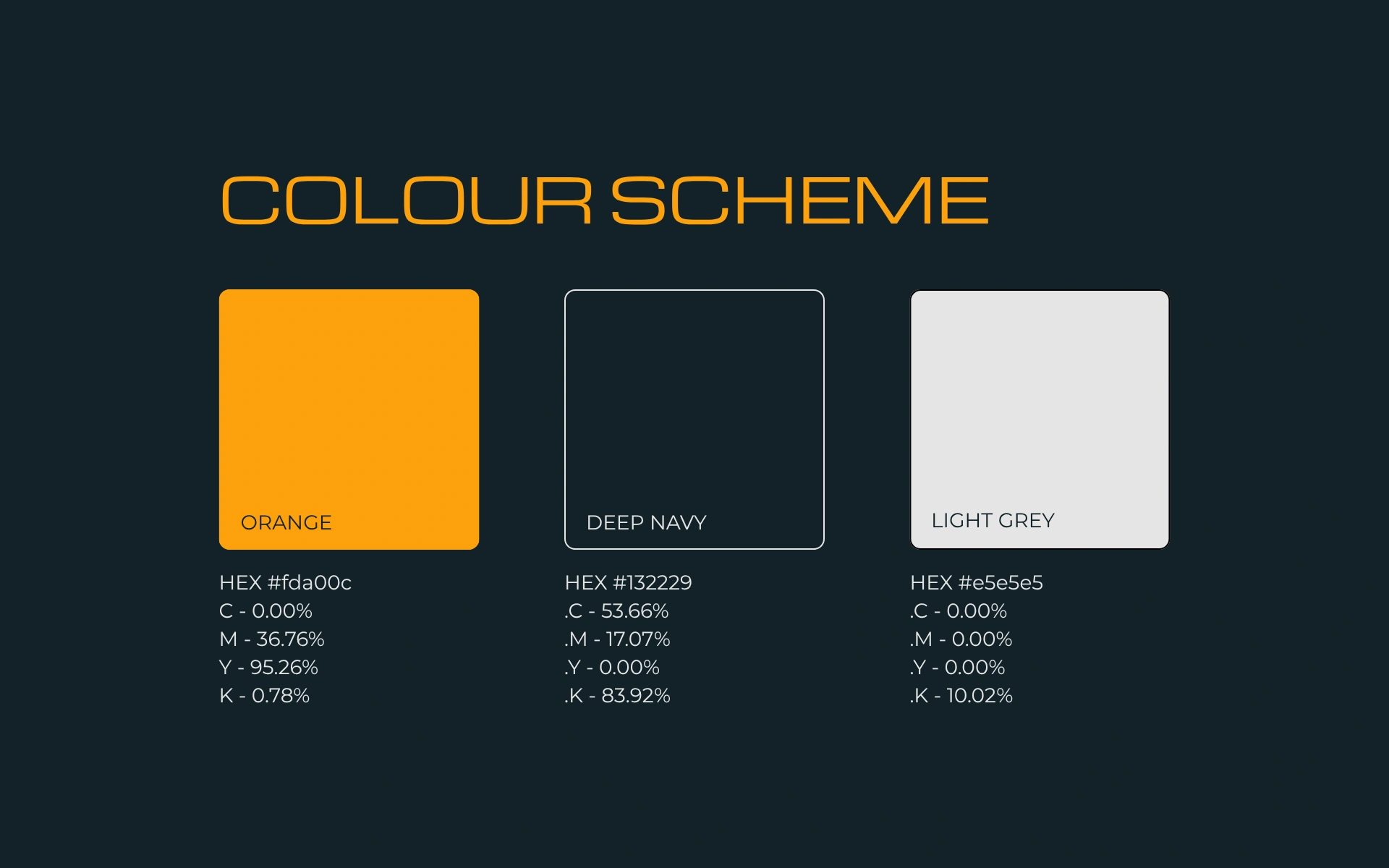
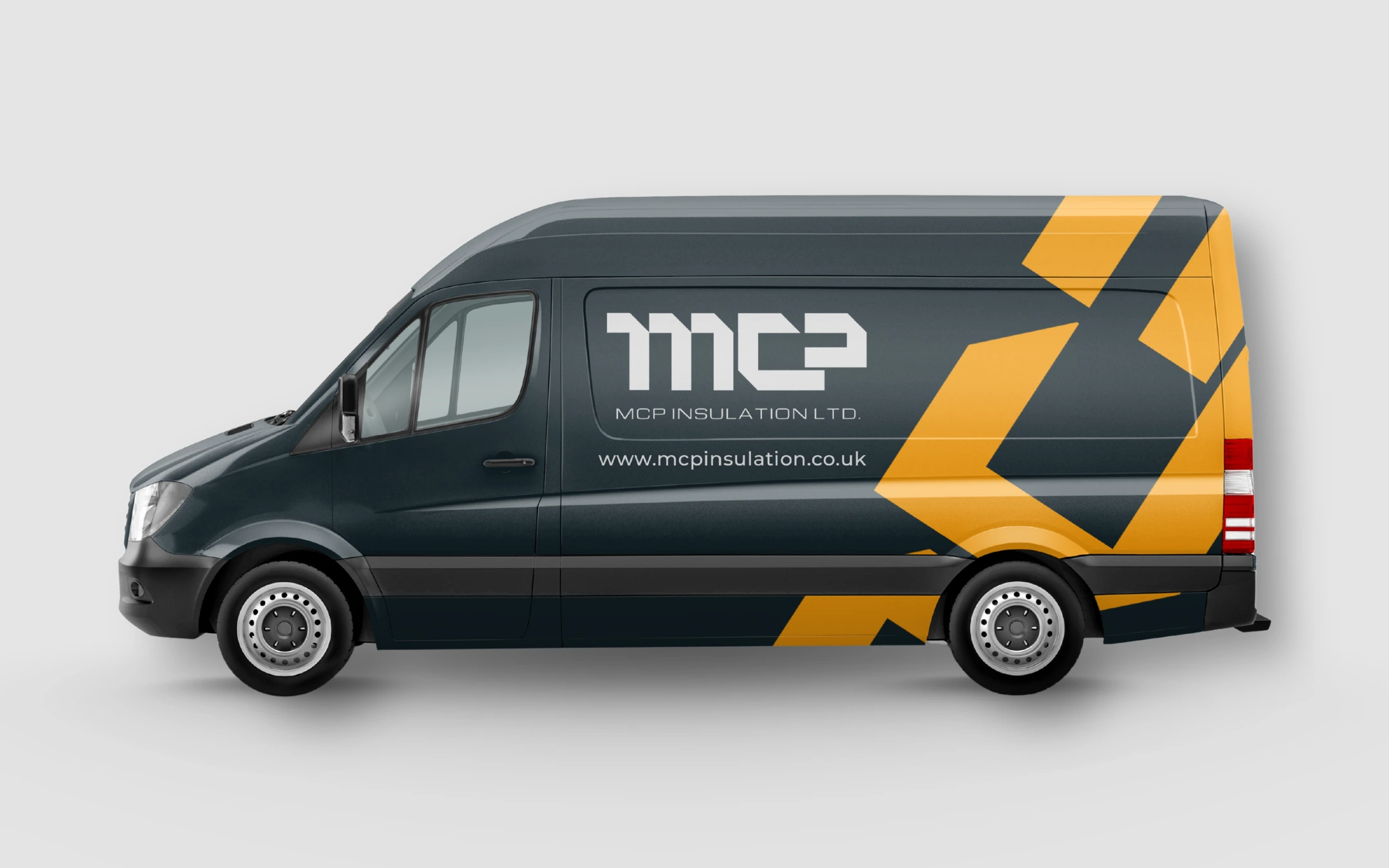
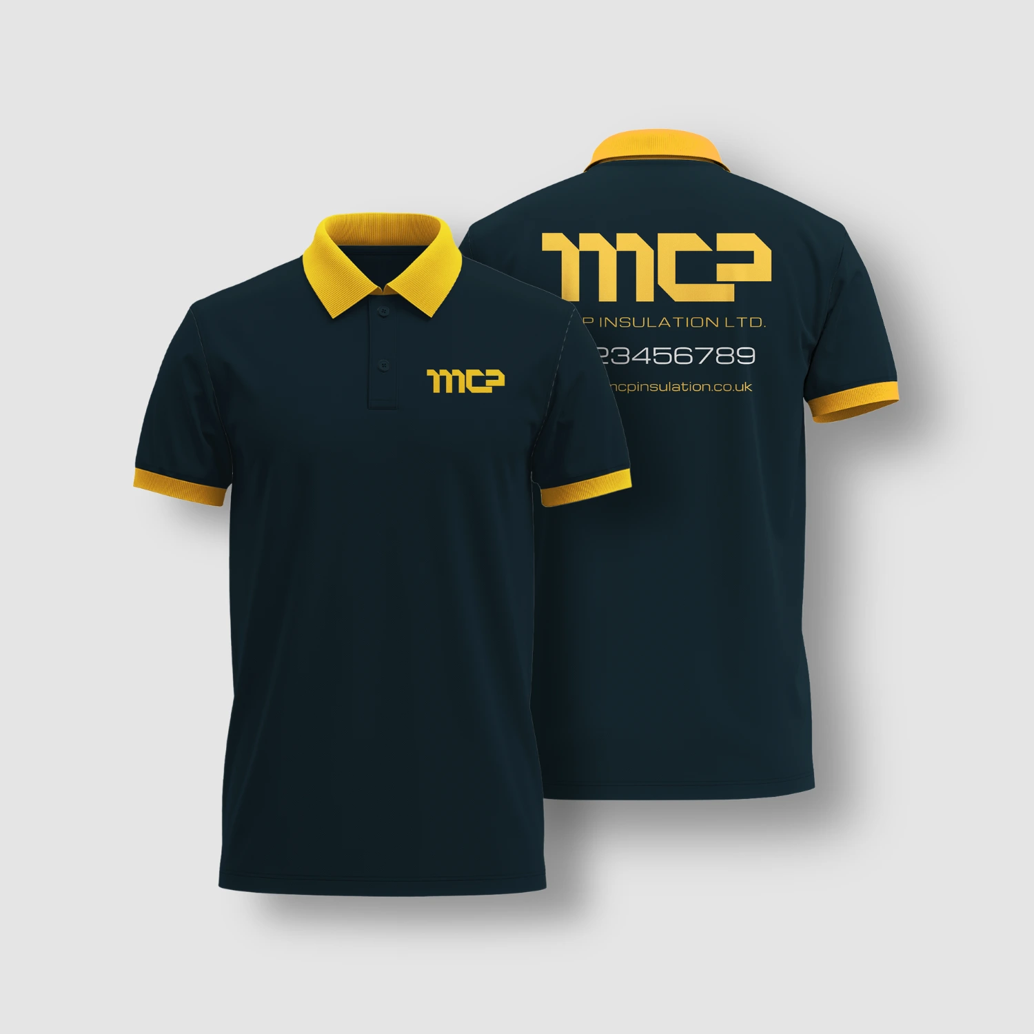
The colour scheme combines vibrant orange, deep navy and light grey to create a bold, modern and highly recognisable visual identity. Together, the palette reflects a
company that is practical, dependable and forward-thinking, while remaining versatile across digital platforms, printed materials,
signage, vehicles and workwear.
Typography
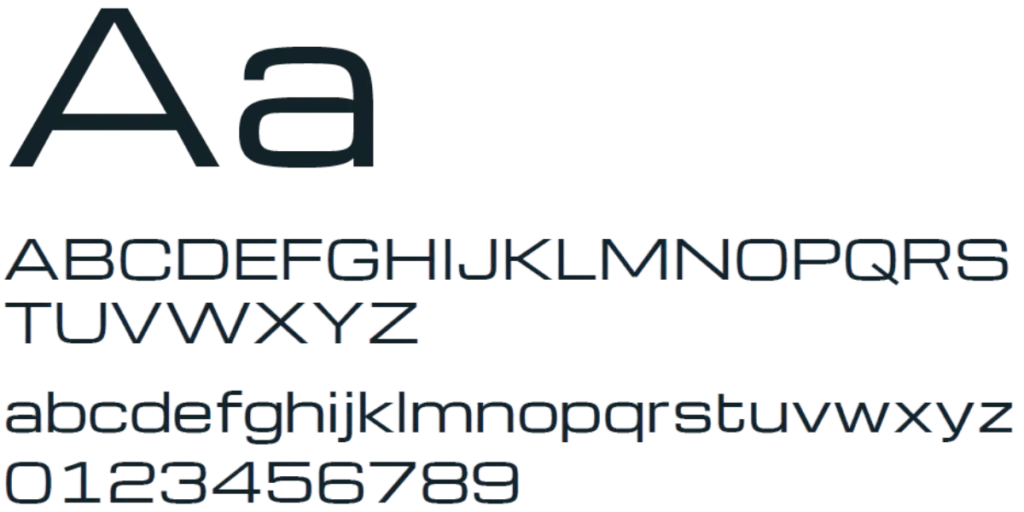
MCP identity uses Michroma within the logo to
reinforce its modern, technical and geometric
character, while maintaining excellent
readability across printed and digital
communications.
For wider brand communications, Montserrat
is recommended for headings and body
content, offering a clean, professional and
highly legible typeface that complements the
logo across print and digital applications.
Visual Identity
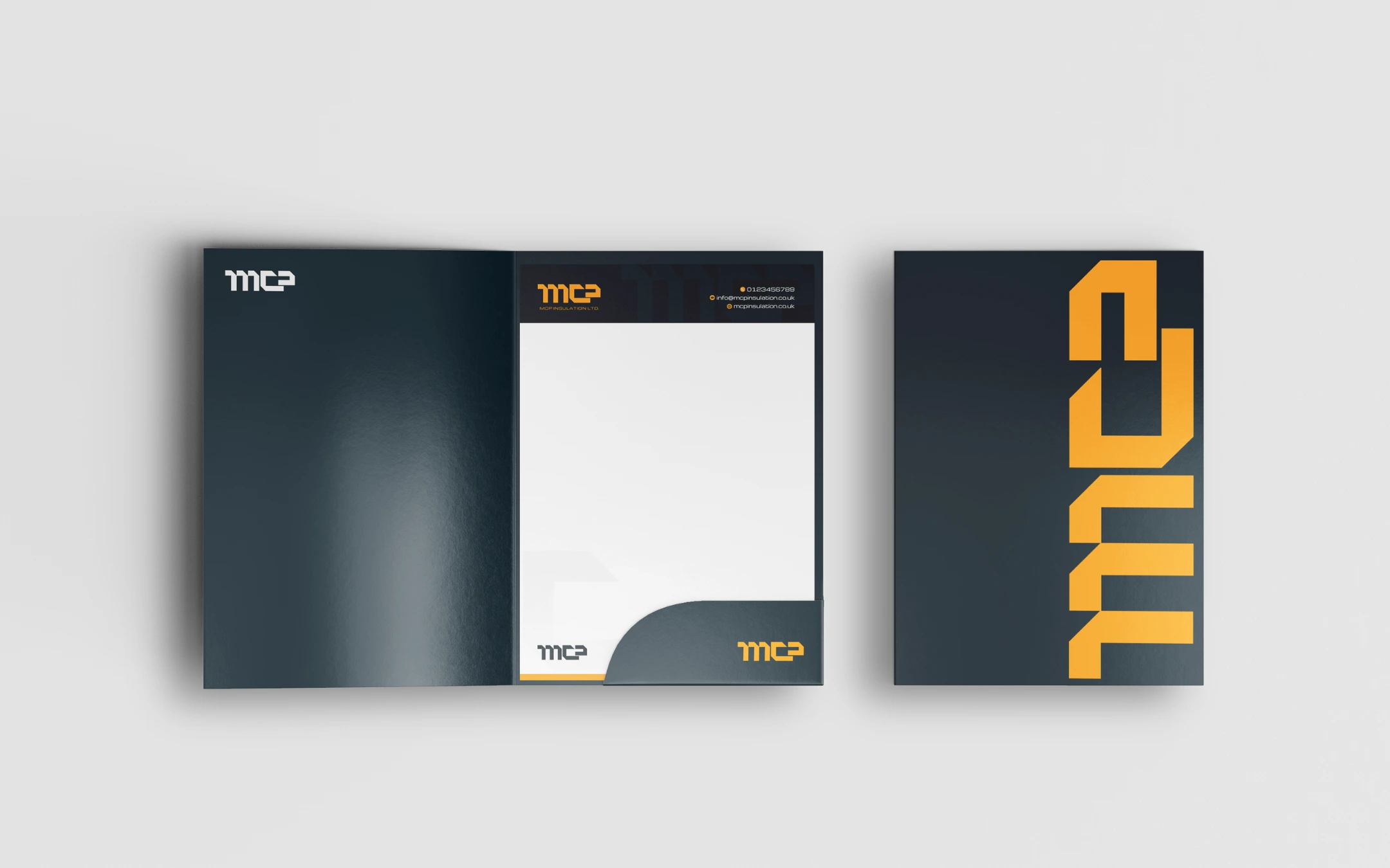
The visual identity was designed to give the business a stronger, more professional presence while still reflecting the practical, technical nature of the insulation industry. A bold colour palette, clean typography and structured layouts create a confident, modern look, while the overall style keeps everything clear, approachable and easy to recognise across both digital and printed materials. The result is an identity that feels established, dependable and built to support the company as it continues to grow.
Website
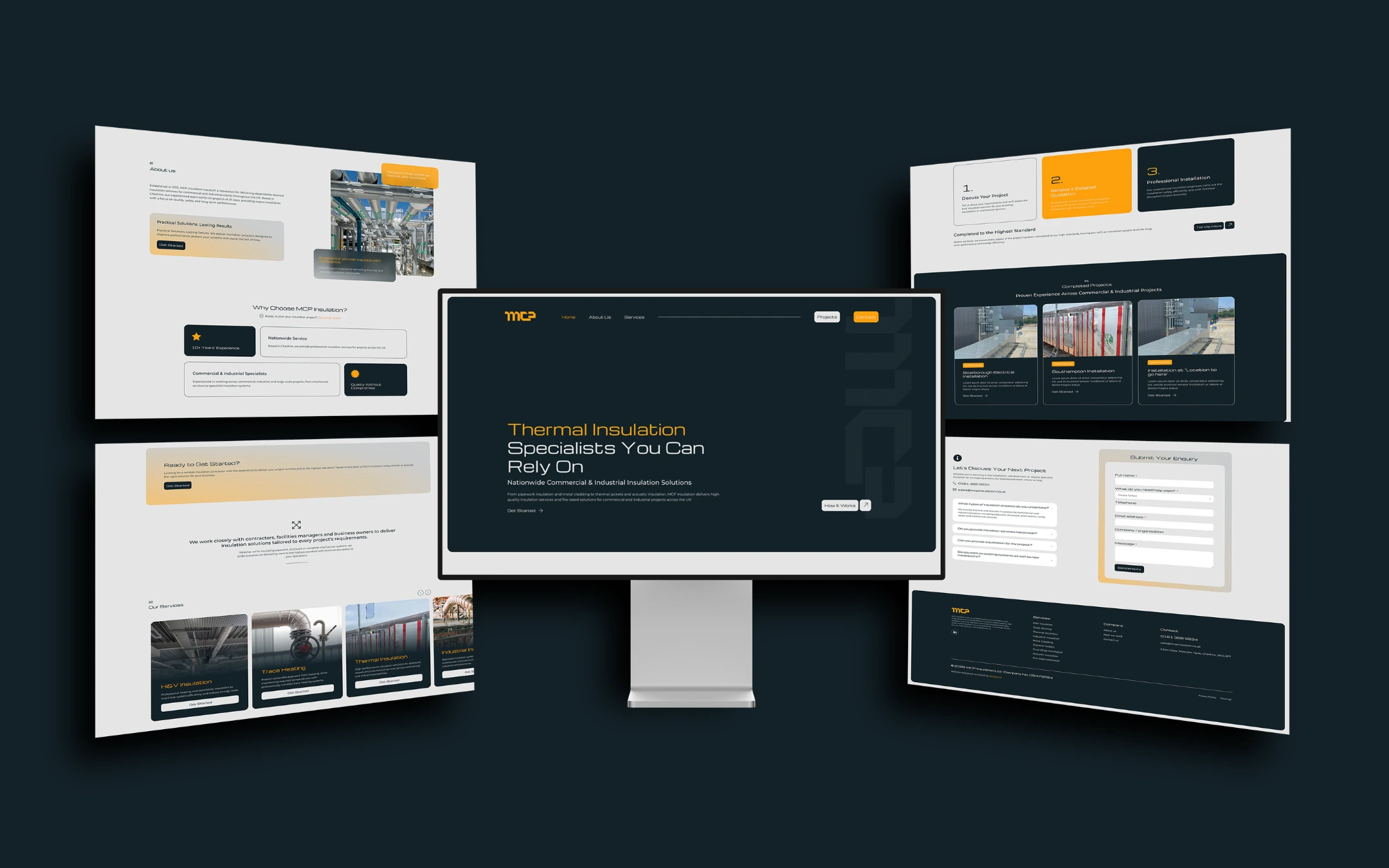
The new website was designed to give the business a more polished and professional digital presence, while making its services easy to understand and navigate. Clean layouts, strong imagery and clear calls to action help guide visitors through the site, with a visual style that ties closely into the wider brand identity. The result is a modern, responsive website that feels credible, straightforward and built to support both new enquiries and future growth.