Brand identity that connects the restaurant’s Latin seafood inspiration with an elegant, modern visual style.
About
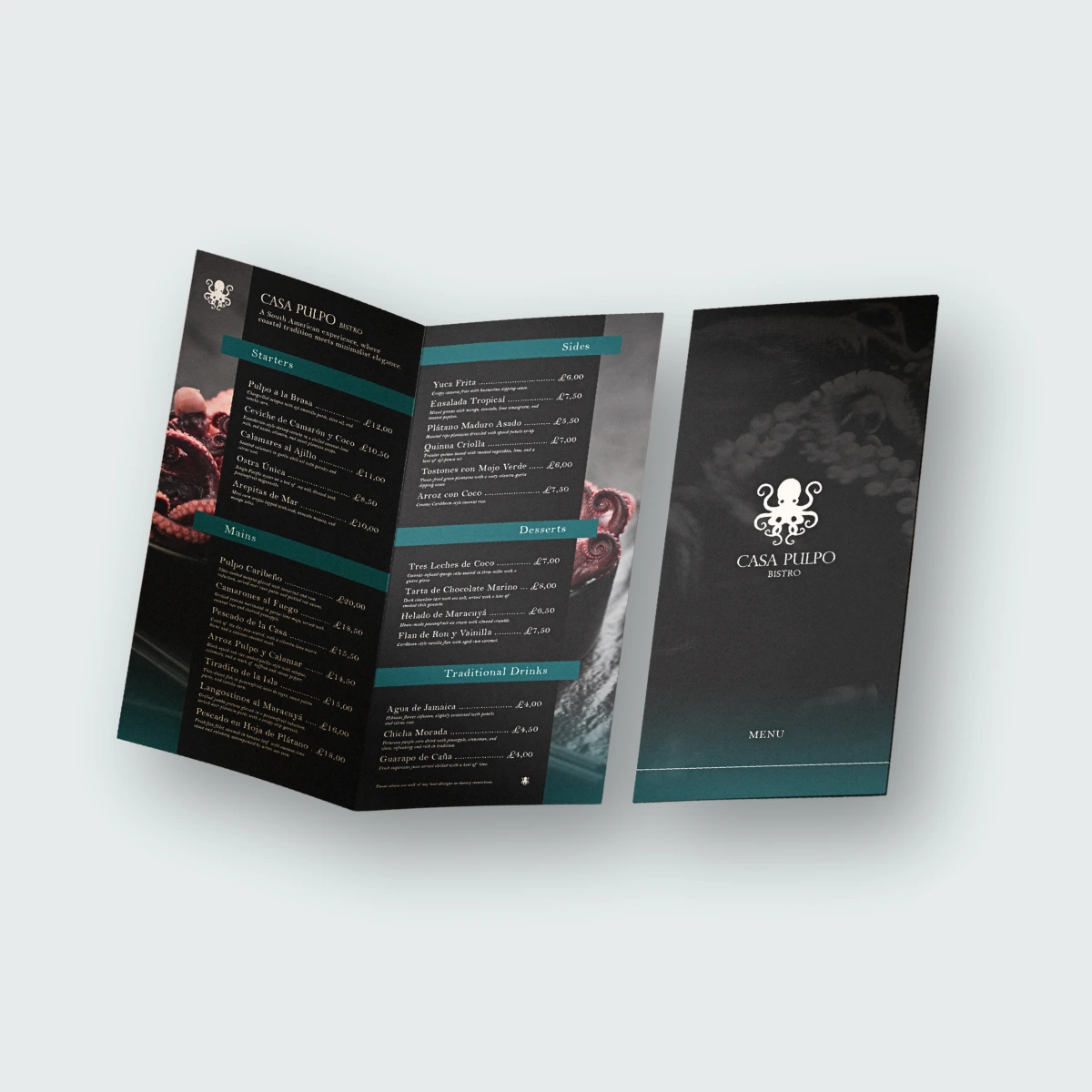
The creative project focused on developing a refined and atmospheric brand identity that connects the restaurant’s Latin seafood inspiration with an elegant, modern visual style. From the octopus-inspired logo and dark colour palette to the menu design, wine bottle label, table tent, signage and digital banners, the brand was designed to feel sophisticated, memorable and consistent across both print and digital applications.
Services
Logo Design
Complete Branding
Share
The Logo
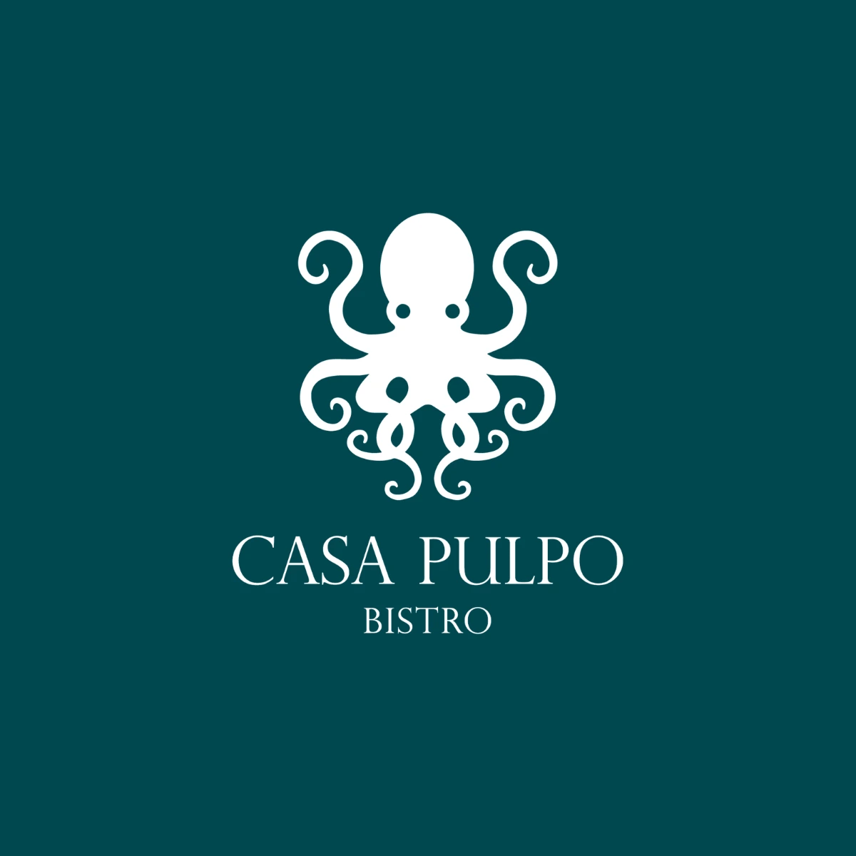
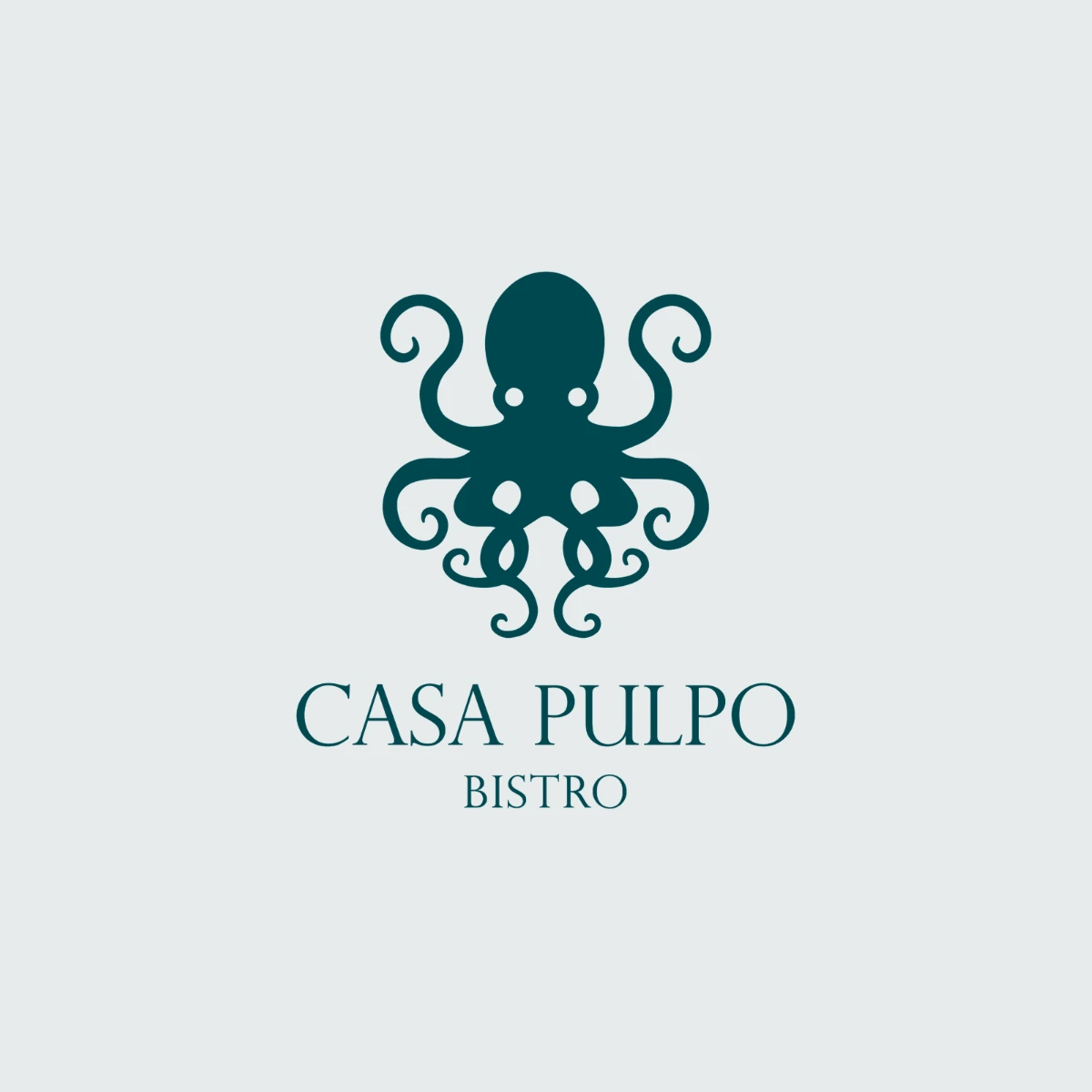
The primary logo combines the octopus isotype with the full Casa Pulpo Bistro name, creating an elegant and memorable representation of the brand. Flowing, curled tentacles give the symbol a hand-crafted, organic quality, while the refined serif lettering beneath adds sophistication and a sense of tradition. The name sits below the symbol for clarity, making this the preferred version for signage, menus, packaging, uniforms and digital communications.
Colours
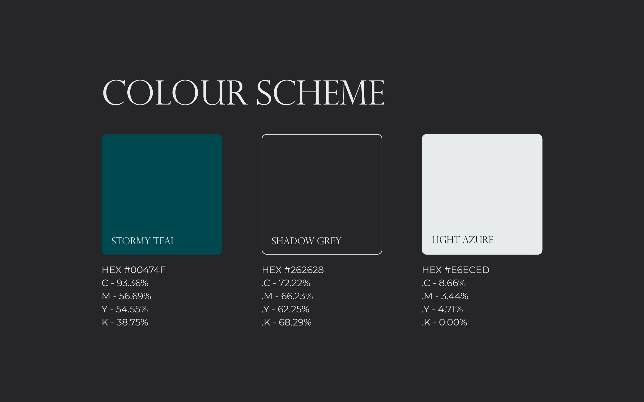
The colour scheme combines deep teal, shadow grey and ligth azure to create a refined, atmospheric and distinctly premium visual identity. The dark tones set an intimate, evening-dining mood, while teal introduces a subtle coastal reference to the restaurant’s seafood heritage. Together, the palette reflects a brand that is elegant, modern and sophisticated.
Typography
The typography pairs Perpetua Titling for headlines with Montserrat Light for supporting text. Perpetua Titling’s classic, engraved-style capitals give the brand a timeless and upscale voice, while Montserrat Light keeps menu descriptions and body copy clean, modern and easy to read. Together they balance tradition with contemporary simplicity across print and digital applications.
Visual Identity
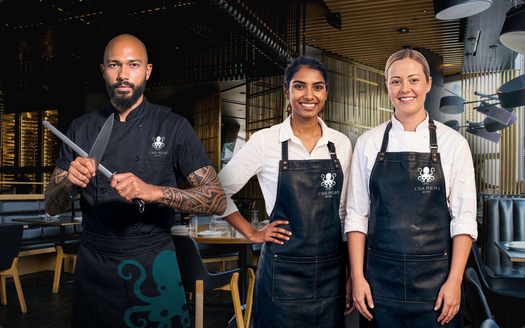
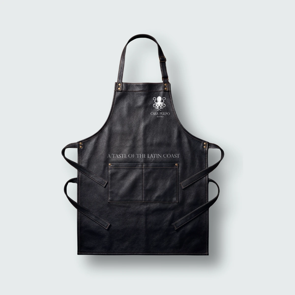
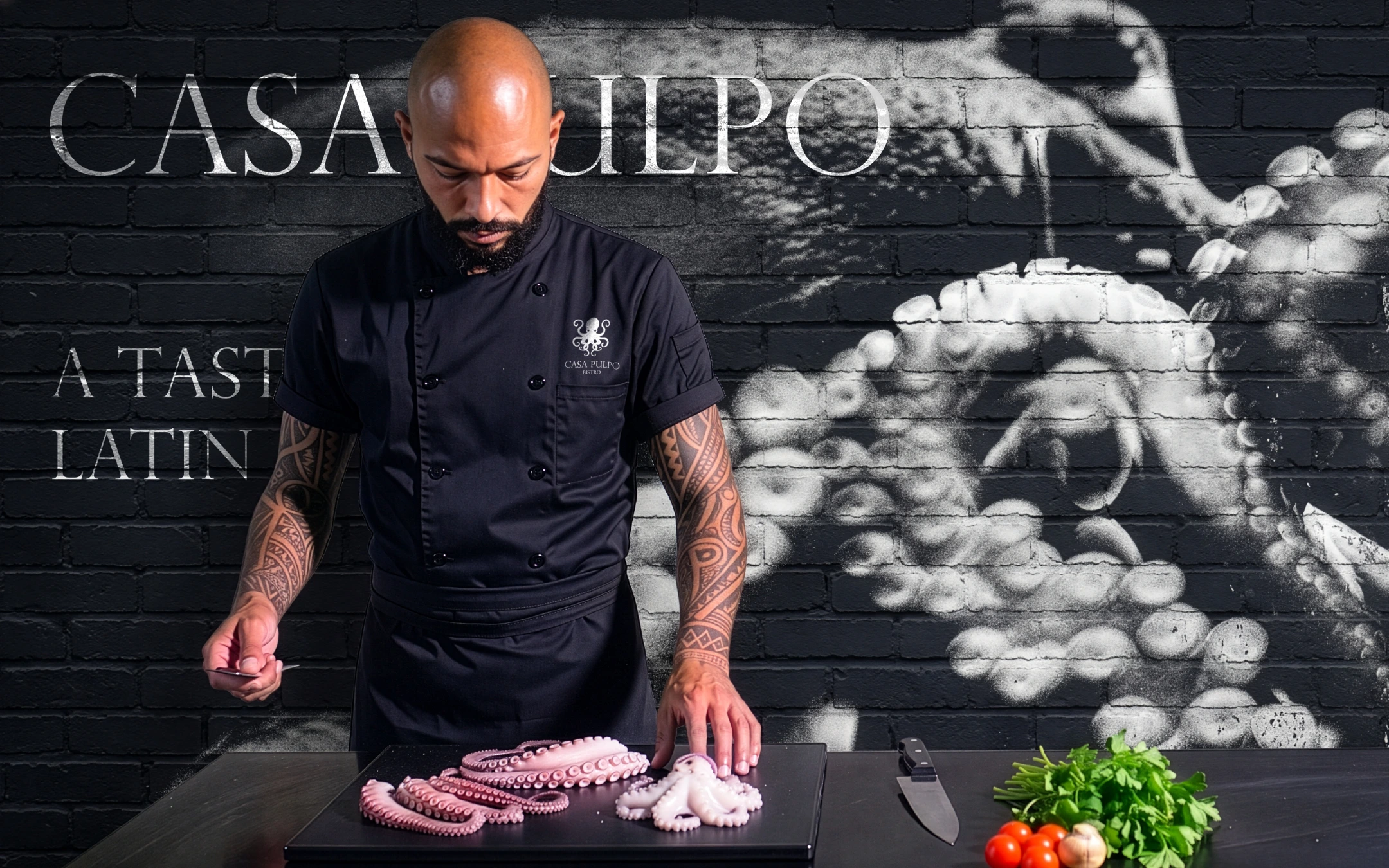
This identity was developed to give a contemporary South American restaurant a refined, atmospheric and memorable presence. It extends consistently across the menu, wine label, table tent, staff uniforms, signage and digital banners, creating a sophisticated and cohesive experience in print, in the restaurant and online.
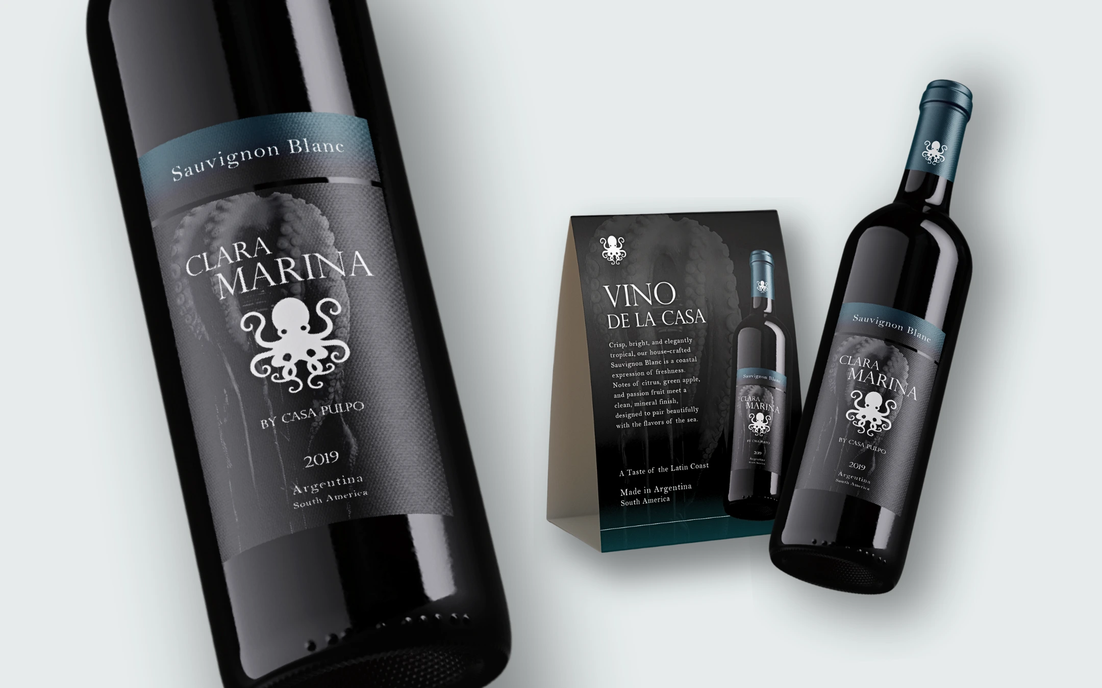
House Wine
The house wine label and table tent carry the brand’s premium aesthetic into drinks and in-restaurant promotion. A dark, textured label with teal accents, the octopus isotype and monochrome tentacle imagery gives the Clara Marina Sauvignon Blanc a refined, collectable presence. The matching table tent promotes the wine at the table, keeping the visual language consistent from bottle to dining room