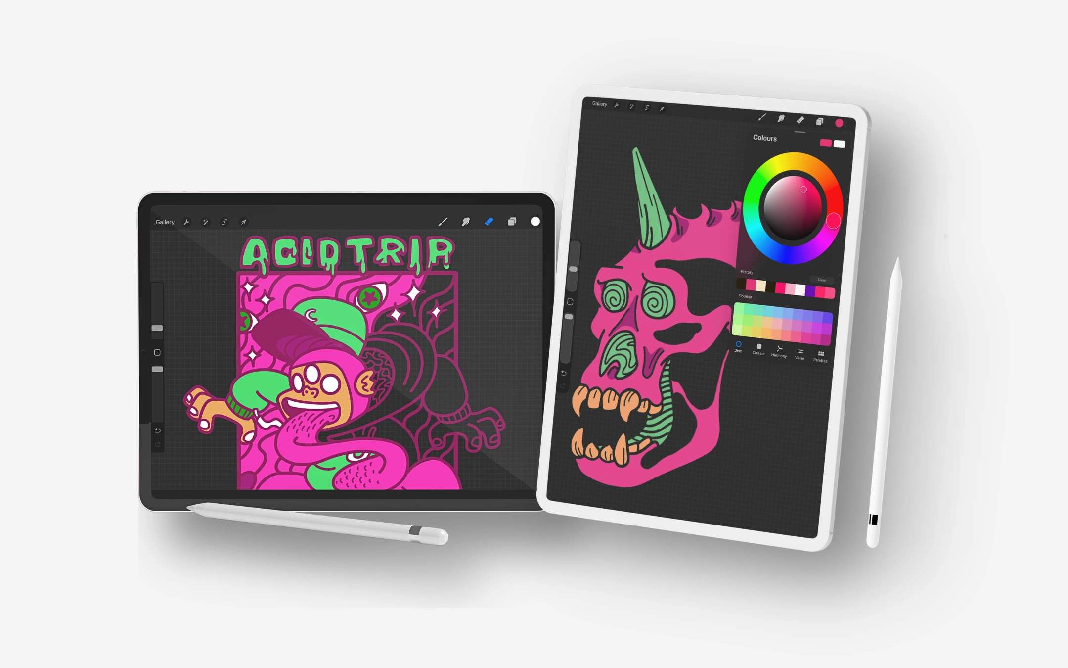
A custom logo and brand identity, then expanded into original hand-drawn artwork for clothing graphics.
About
An urban streetwear brand built around bold self-expression, psychedelic visuals and alternative youth culture. The project started from the ground up, beginning with a custom logo and brand identity before expanding into original hand-drawn artwork, clothing graphics, packaging, print material and promotional assets.
Services
Digital Illustration
Clothing Graphics
Complete Branding
Share
The Logo
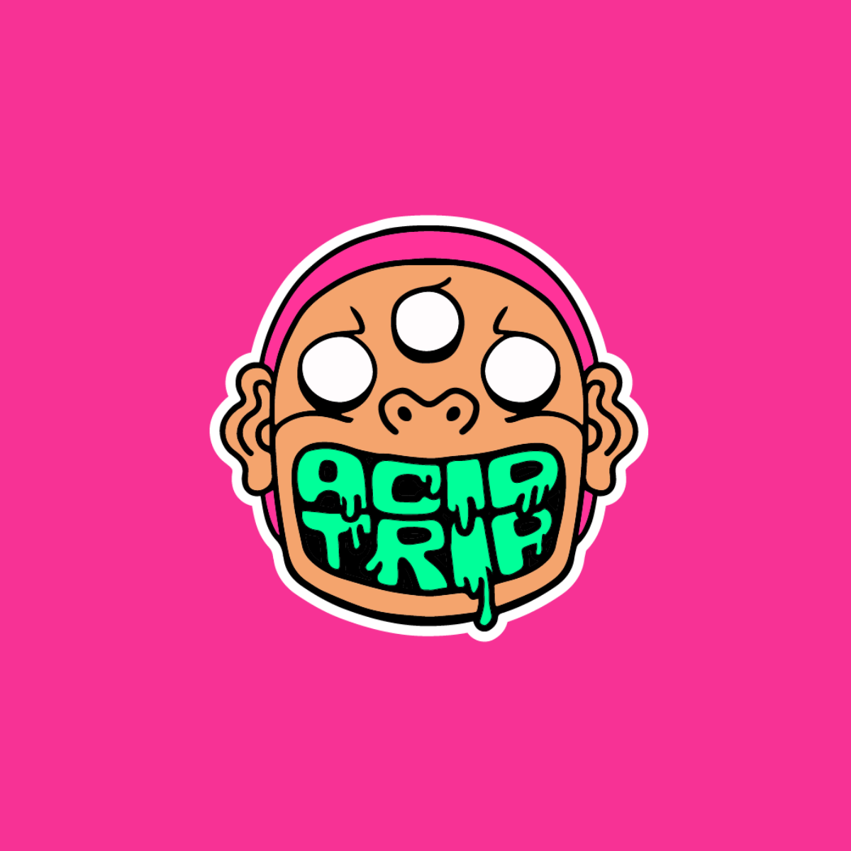
The primary logo combines the three-eyed character with the full Acid Trip wordmark, creating a bold and instantly recognisable representation of the brand. Thick black outlines, a hot pink background and neon green dripping lettering give the logo a loud, sticker-ready energy, while the wide-open mouth and wide-eyed expression capture the psychedelic and rebellious spirit. With the name set inside the character itself, the mark works as both illustration and wordmark, making it the preferred version for clothing graphics, packaging, print material, social media and promotional assets
Colours
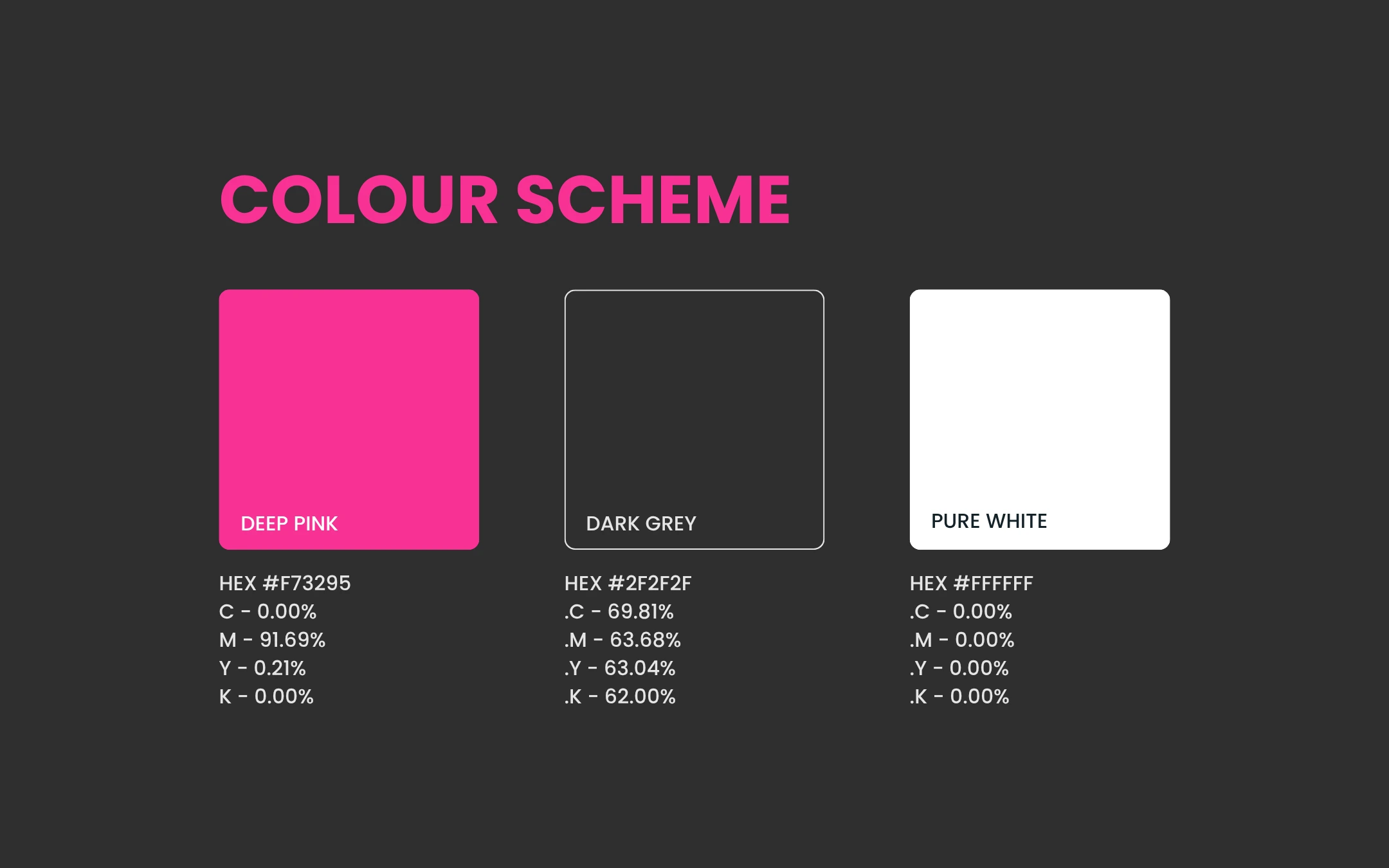
The colour scheme combines a hot pink, anchored by bold black outlines and crisp white accents, to create a loud, energetic and unmistakable visual identity. The high-contrast of a hot deep pink captures the psychedelic, rebellious spirit of alternative youth culture, while the black linework keeps the artwork sharp and graphic. Together, the palette reflects a brand built on self-expression and attitude, while remaining versatile across clothing graphics, packaging, print material, social media and promotional assets.
Typography
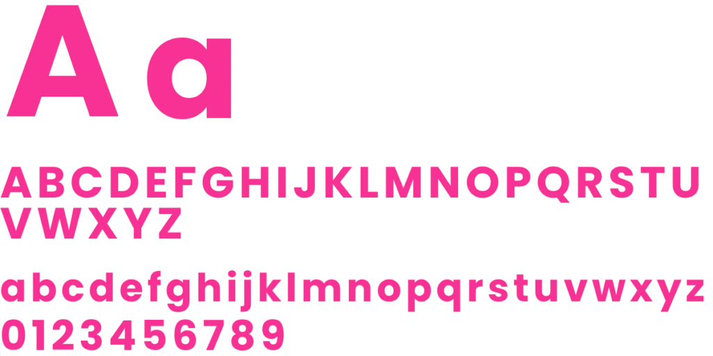
Poppins Bold is used for headlines and key messages, giving the brand a strong, confident voice, while Poppins Regular keeps body copy clean, modern and easy to read. Its geometric, rounded forms balance the expressive, psychedelic artwork, ensuring the identity stays legible and consistent across clothing graphics, packaging, print material, social media and promotional assets.
Visual Identity
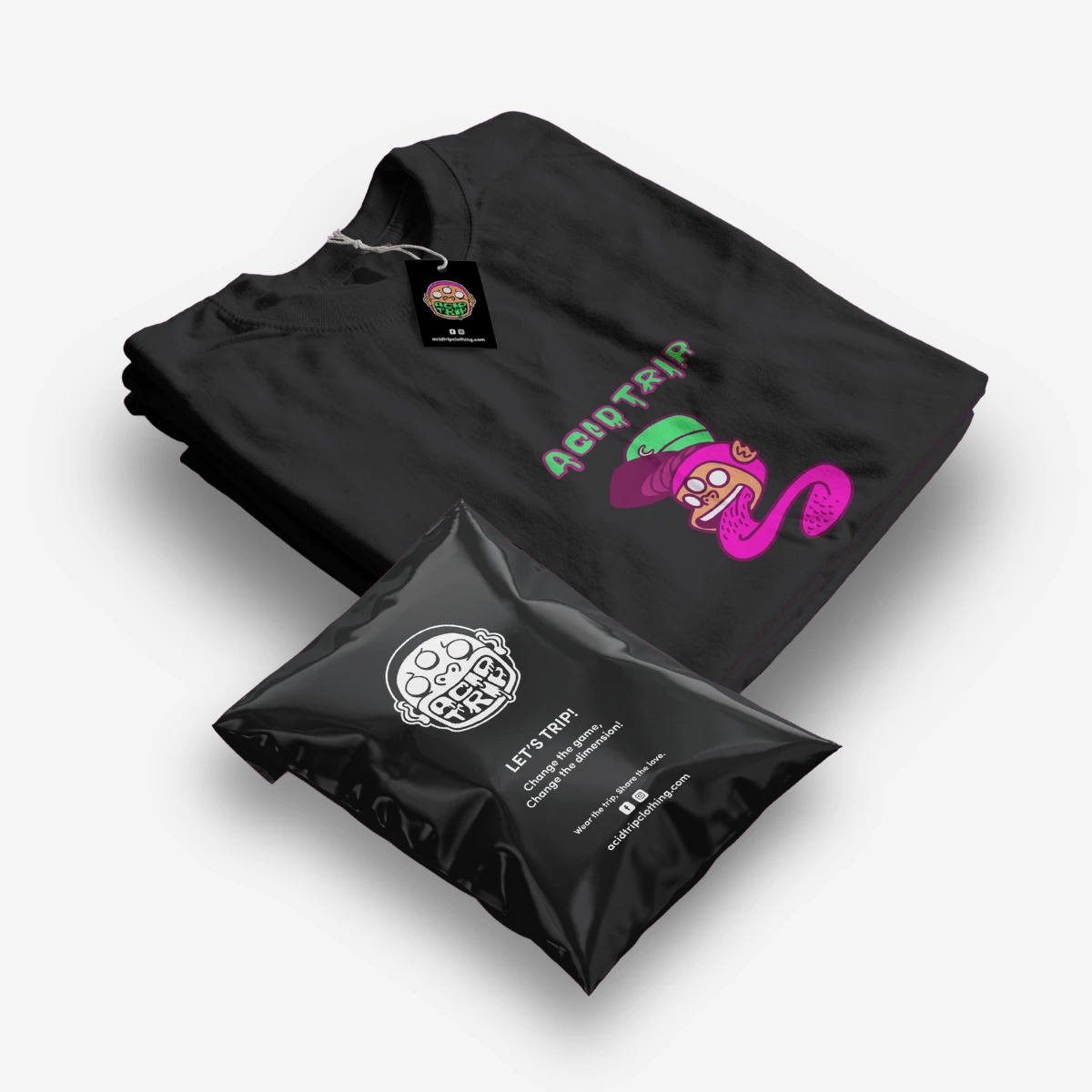
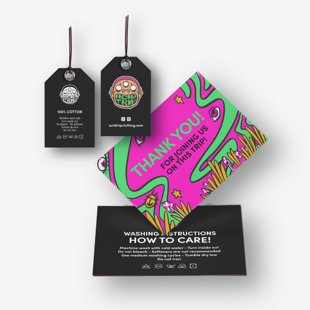
The concept is based on the idea of standing out, changing the mood and creating clothing that feels more like wearable artwork than standard fashion. The final identity gives Acid Trip a strong and recognisable visual presence across clothing, packaging, online marketing and digital retail.
Collection
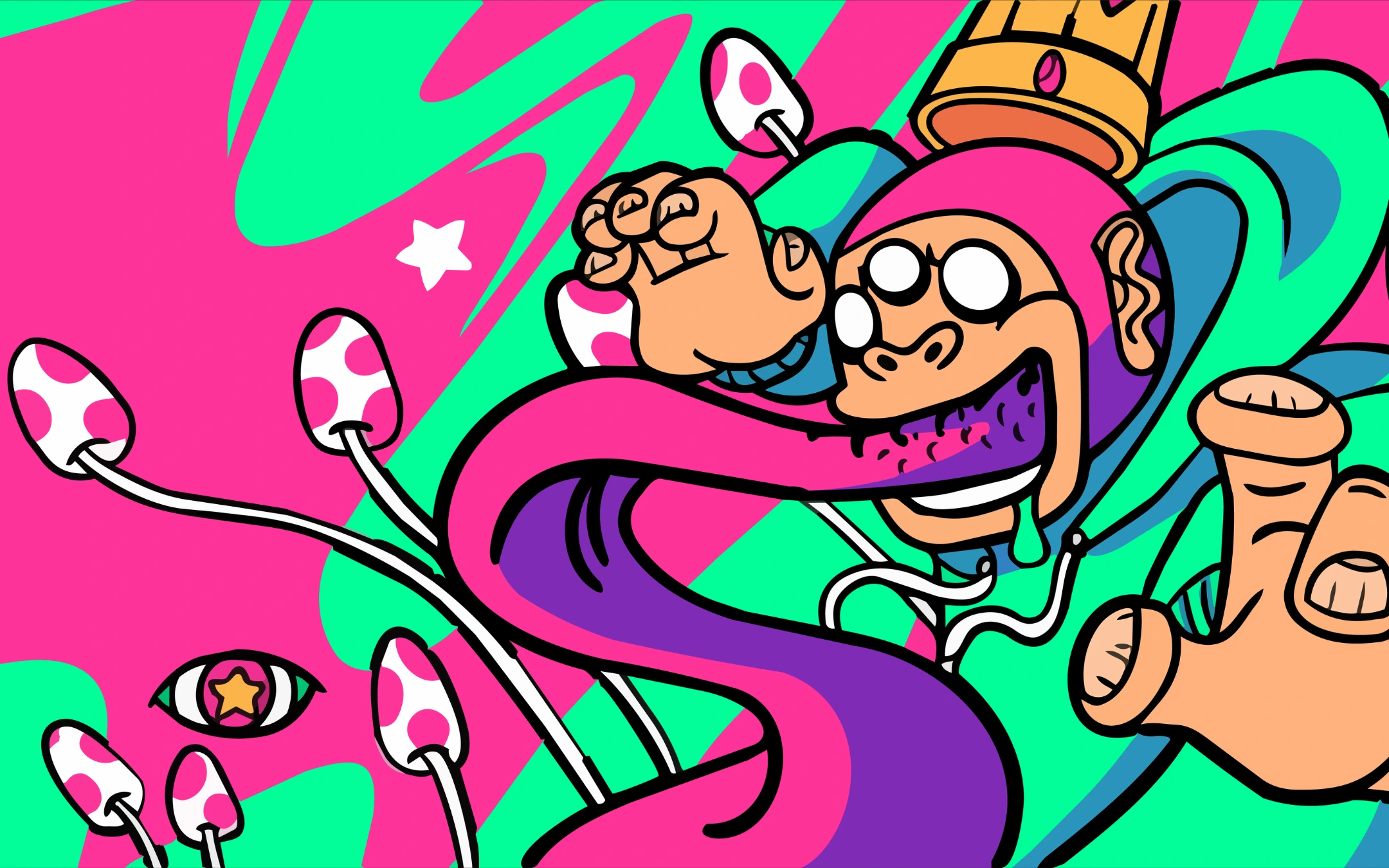
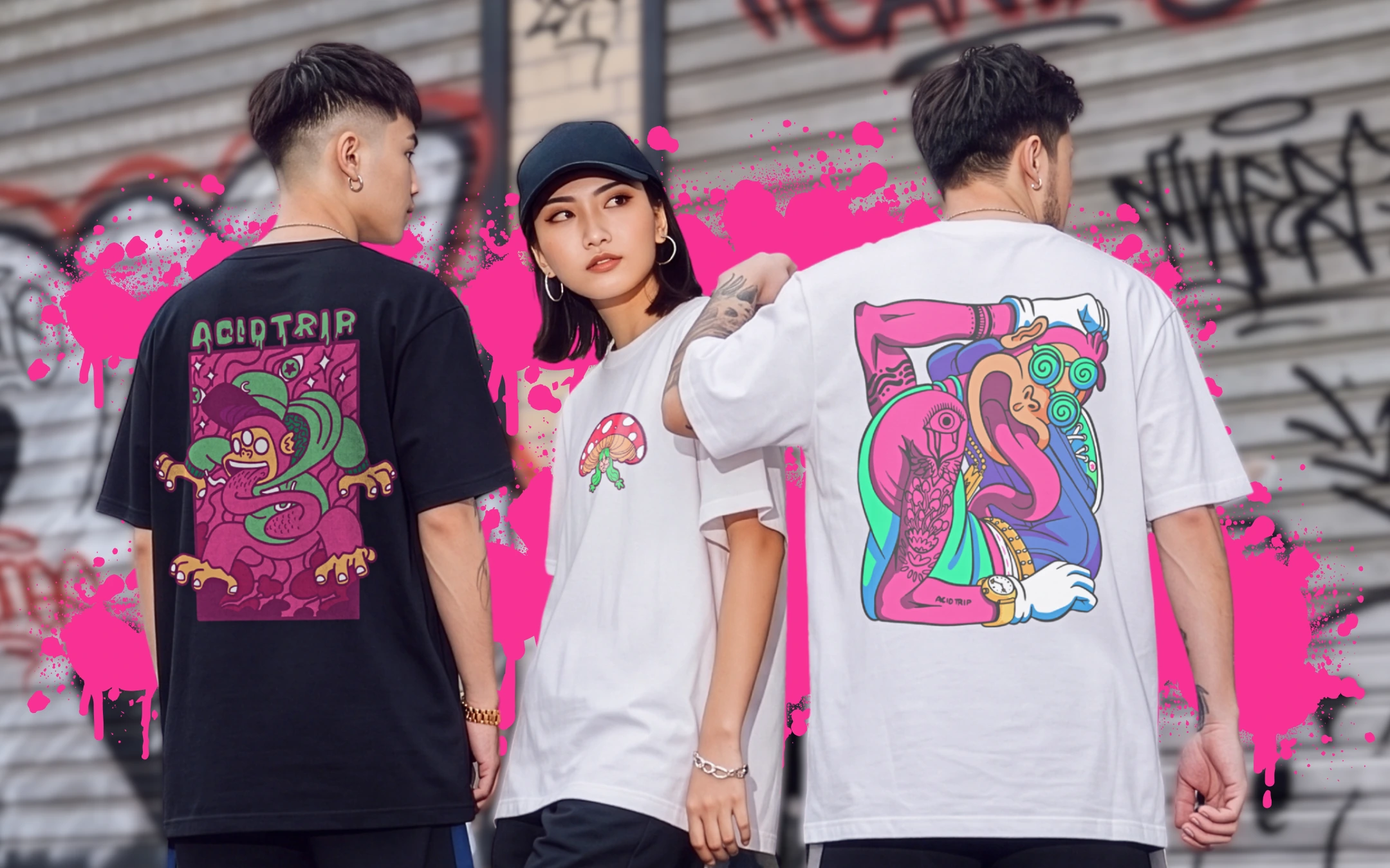
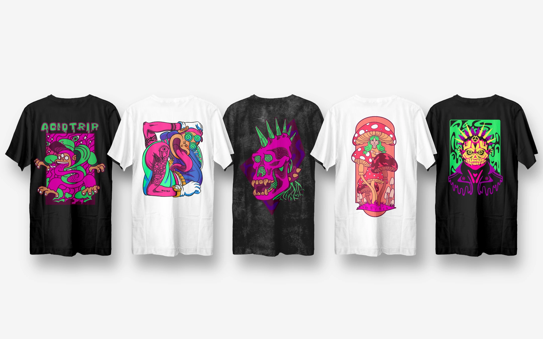
The first collection brings the brand to life through a series of handcrafted digital illustrations, each custom made and adapted specifically for clothing printing. Surreal characters, psychedelic mushrooms, spiked skulls and twisted figures are drawn with thick linework and saturated neon colour, capturing the rebellious, alternative spirit of the brand. Every design is composed to sit confidently on the back of a tee, working across black, white and washed fabrics while keeping the artwork sharp, bold and full of personality.